
In this lesson, we were taught the basics of Publication Designing. We began the lesson by having an extensive discussion of the Tone in which different publications are written.
We were then introduced to the building blocks of creating desirable publications, I learnt that I had to focus on factors such as Intent, Typography and the prioritisation of text while using different fonts in the same layout.
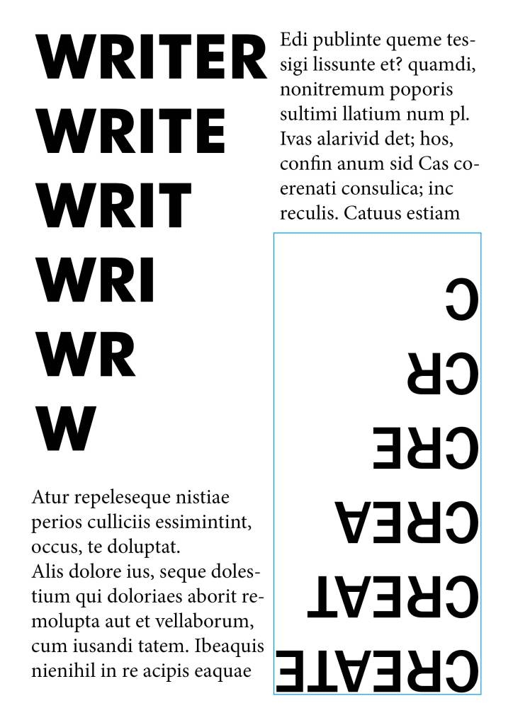
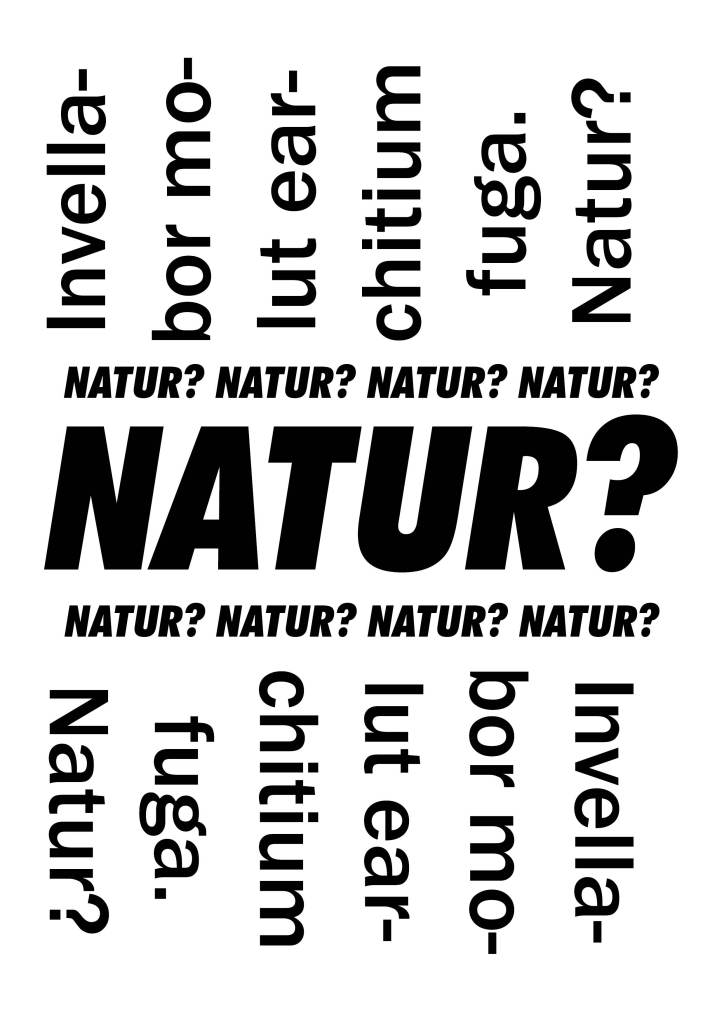
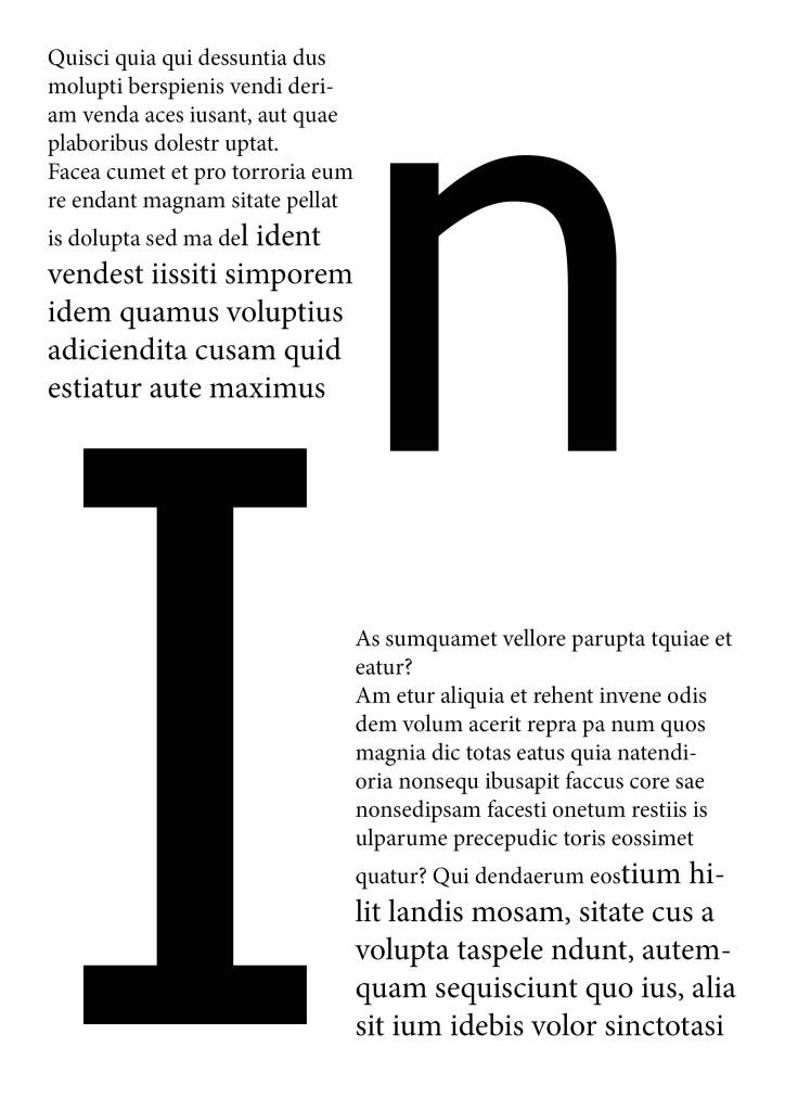
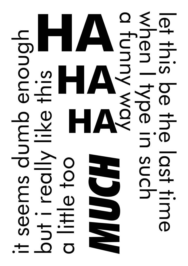
I started Learning and Understanding different forms of Typography, Indesign as a tool has a filter funnel system that provides the user with the ease to choose between different fonts from the same family. It filters out fonts having the same family such as- Sans Serif, Serif, Handwritten etc.
Jai Sirs’s Advice for us was to start drawing straight and curved lines with different random tools to get better with typography.
and to try to understand width, weight and form.
I also learnt the following terms during class.
Kerning and Leading- Adjustments in Typography
Ligature- Combining two letters.
Uncanny Valley- Here’s where you know something is off.
I was introduced to different font families and understood the importance of fonts that are not very common in branding and strategic use. I realised that Comic Sans Ms is an important font designed to better the reading for individuals dealing with autism.
I realised that as Designers, we need to give people a choice and that UI UX is required everywhere.
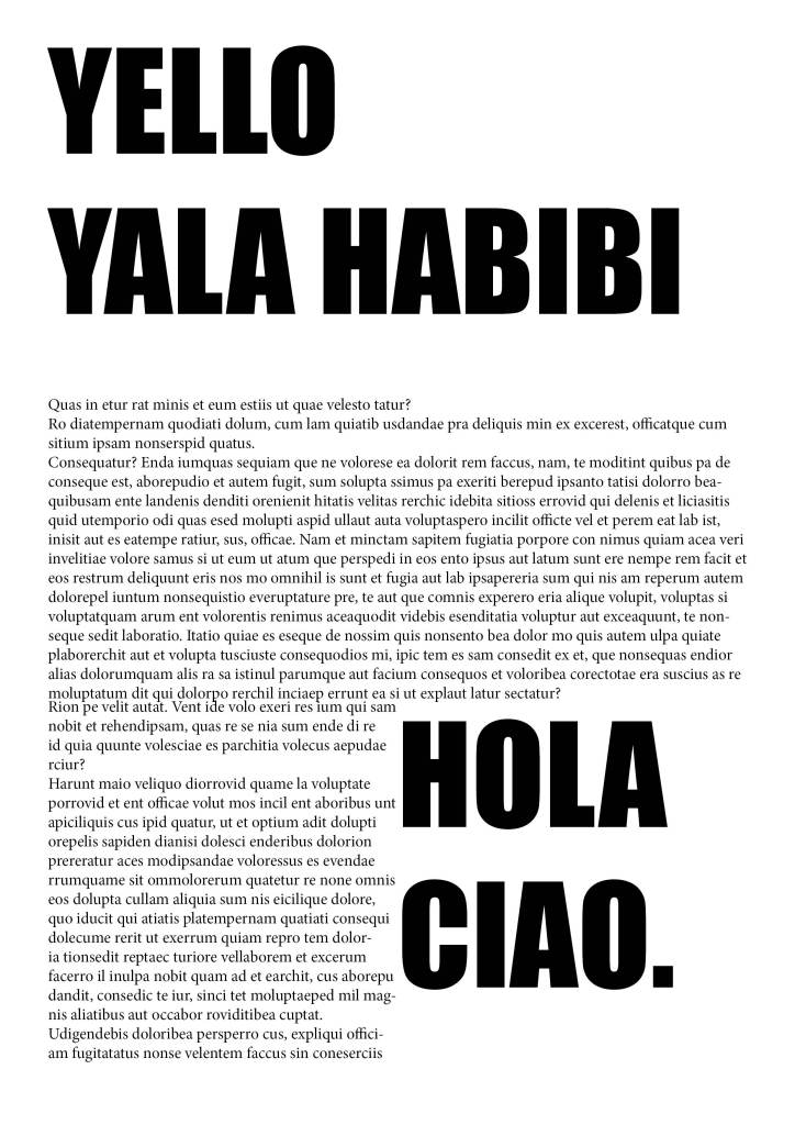
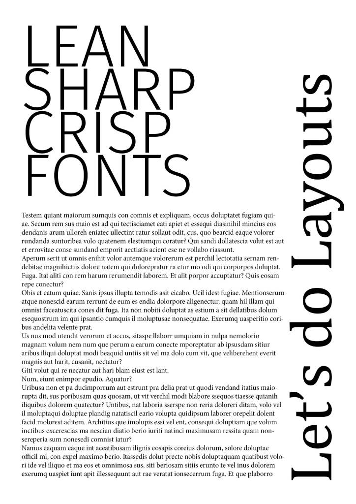
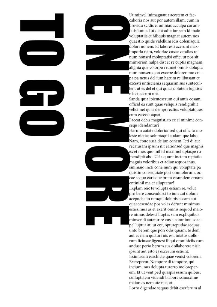
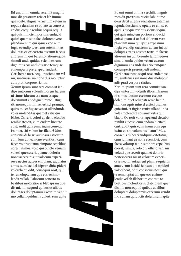
In this lecture, we were assigned to create a 12-page docket that includes exploration of different typefaces and layouts.
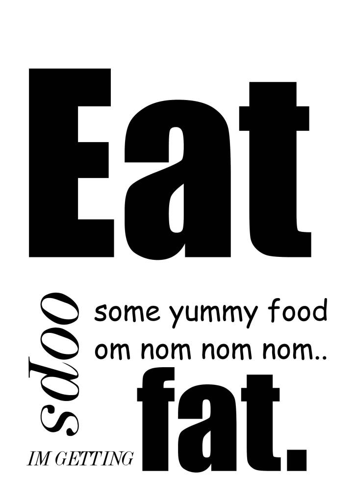
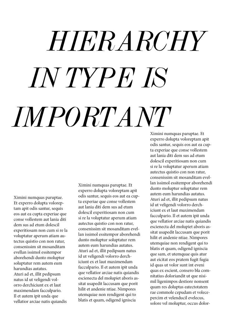
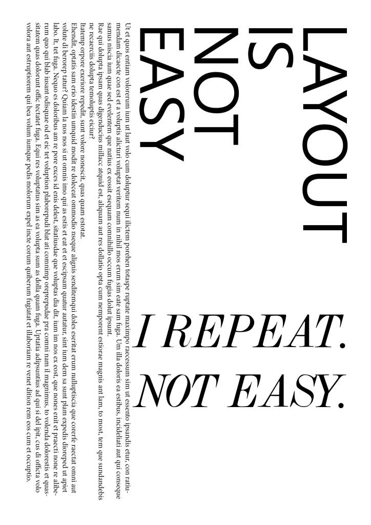
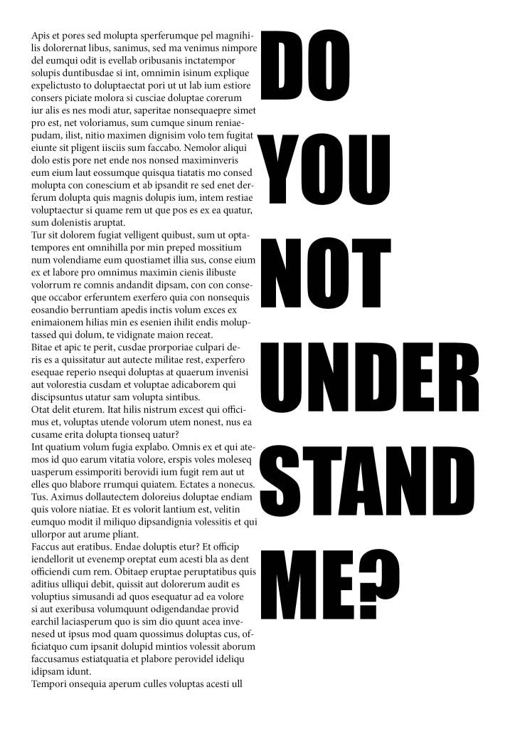
I created the following layouts for exploration purposes.