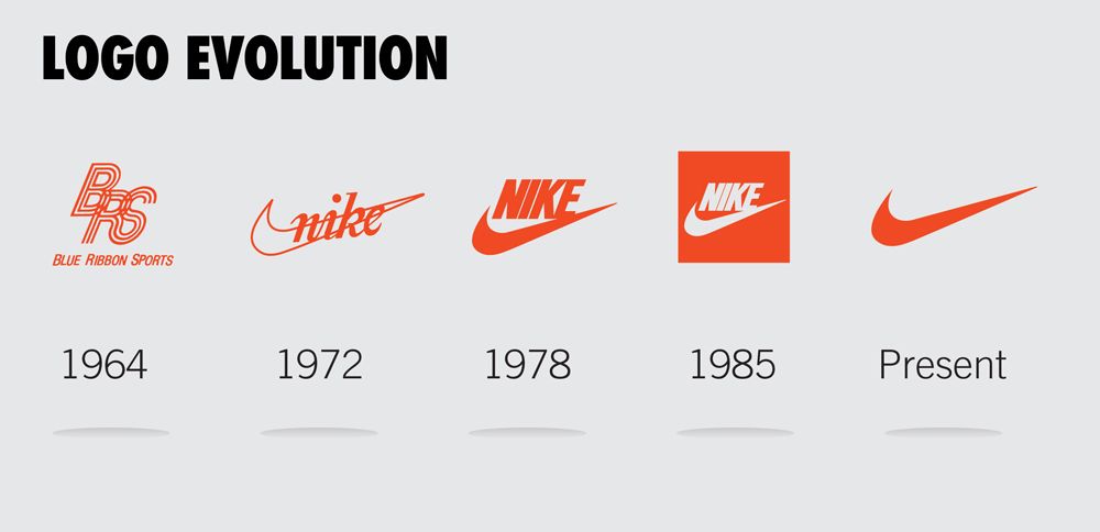

In the following Strategic Design Management Class, we were introduced to the basics of Logo Design and were shown a case study on the brand Pepperfry and its evolution over the years. The presentation gave us an idea on how Strategic Design Managers create briefs for communication designers after understanding user personas, analysing the brand’s message and delivering the same to the end-user to create a desirable experience/outcome. We were assigned to do a similar case study on any brand and identify what could be the strategy behind the change in the logo and why was it made in that particular way. I chose the brand of Nike.
To my understanding these are the following changes I think could have been the reason to change the logo over time:
1972: The change from “Blue Ribbon Sports” to “Nike”, The duo of Bill Bowerman and Phil Knight originally distributed Onitsuka tiger footwear under their brand from 1964 up until now. They now moved into their brand called “Nike”, Nike is the powerful name of the Greek goddess of victory. Carolyn Davidson Designed this Particular Logo.
1978: I believe Nike Changed Their Logo with a Stronger and More Sophisticated Font to show that their brand identity was a matter of pride that comes with a victory it also according to me signifies a sort of fast-pace that is shown as the logo is in Italics.
1985: I believe Nike now reversed their original colour palette to prevent the sale of counterfeit goods and to establish their brand identity with power and purity.
Now: The Current Swoosh According to me delivers a message that they are at a humongous global scale that they no longer need to use their name in their logo anymore. The “nike swoosh” is all that is required to convey their strong brand identity, This could also signify that they are a minimalistic brand that delivers consitently high quality products with simplistic designs that sell at a large scale.