
Work Assigned: In the following Imaging class, we were assigned to continue working on our coffee table books
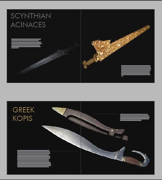
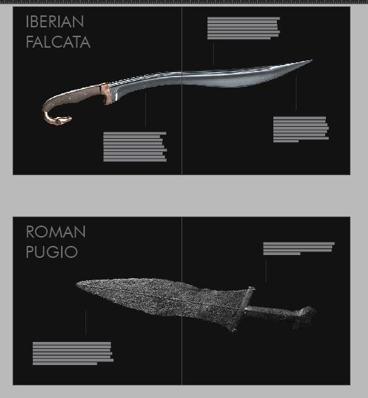
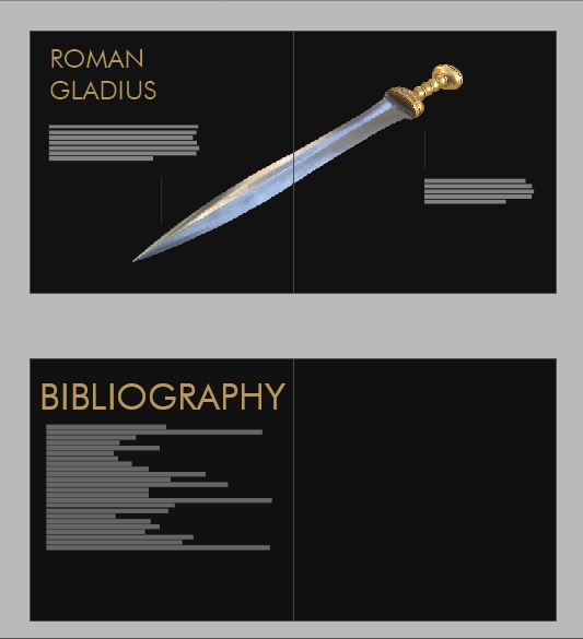
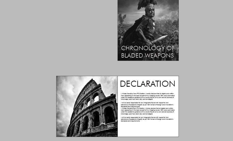
Process: I realized the previous week that I had wasted a lot of time working on very minute details of my book, knowing that if i had continued that way I would’ve not been able to work on the other bigger aspects of my book. I dropped all other ideas and started working on putting all my research information together first. I then went on to finalizing my color palette. Then I started on editing all my images in Photoshop by de saturating them first and then by changing the blending modes of my image. I then applied a layer of solid color from my color palette underneath the image. I then readjusted my blending mode in the image layer to get the desired color filter. I repeated this simple yet effective process for all my images and then scaled them accordingly in Indesign. After finishing the image edits, I started to place my information onto the indesign page. I had then started exploring with fonts to fit the experience that I wanted to deliver with my book. I had then narrowed down my choice to Futura Bk BT as my title font, reason being that the font has sharp edges which goes really well with my aspect- Swords, and therefore represents the essence of their sharpness. Futura is also a classic Sans Serif Font that is aesthetic simplistic and is easy to read therefore works well on titles. Here, I kept in mind the method proposed by Paul Rand in his book “Conversations with students” about the concept of building relations between “Form and Content” therefore I felt that the form of my font was related very well with my content hence narrowed down on choosing it. I used the serif font Minion Pro as my text font as it is a simple, readable font which has the form that gives it an ancient looking aesthetic, which builds the relation between the “form and the content” of my book and also because it pairs well with my title font. I then, went on to put everything together.
Critical Reflections: While performing the following task I referred a lot to my past reading which then helped me a lot to do this assignment. I was happy to see the dots connecting now and realized that to become a better designer I would have to read more, observe more and produce more work. I also understood now that I need to keep having discussions with my faculty regarding every progress I have made in order to receive feedback to better my work. This back and forth process also made me realize that design work can never take place in isolation and it is very important to keep backup files at every end to make sure that edits could be made and remade at any given point in time.